pacman::p_load(ggrepel, patchwork,
               ggthemes, hrbrthemes,
tidyverse) Hands-on_Exercise2
2 Beyond ggplot2 Fundamentals
2.1 Overview
ggplot2 extensions for creating more elegant and effective statistical graphics.
2.2 Getting started
2.2.1 Installing and loading the required libraries
ggrepel: an R package provides geoms for ggplot2 to repel overlapping text labels.
ggthemes: an R package provides some extra themes, geoms, and scales for ‘ggplot2’.
hrbrthemes: an R package provides typography-centric themes and theme components for ggplot2.
patchwork: an R package for preparing composite figure created using ggplot2.
2.2.2 Importing data
exam_data <- read_csv("data/Exam_data.csv")2.3 Beyond ggplot2 Annotation: ggrepel
ggplot(data=exam_data,
       aes(x= MATHS,
           y=ENGLISH)) +
  geom_point() +
  geom_smooth(method=lm,
              size=0.5) +
  geom_label(aes(label = ID),
             hjust = .5,
             vjust = -.5) +
  coord_cartesian(xlim=c(0,100),
                  ylim=c(0,100)) +
  ggtitle("English scores versus Maths scores for Primary 3")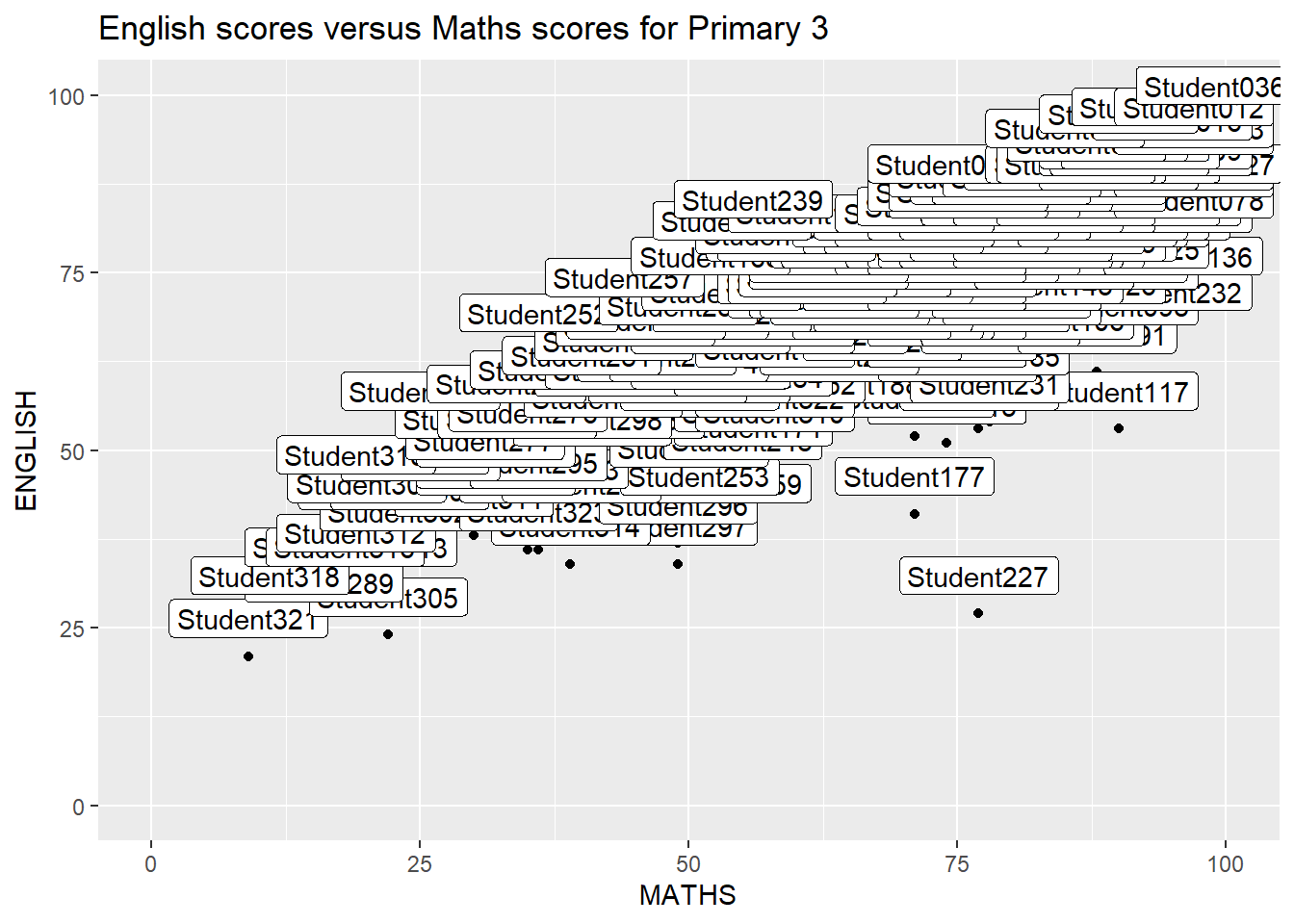
ggrepel is an extension of ggplot2 package which provides geoms for ggplot2 to repel overlapping text as in our examples on the right.
Replace geom_text() by geom_text_repel() and geom_label() by geom_label_repel
2.3.1 Working with ggrepel
ggplot(data=exam_data,
       aes(x= MATHS,
           y=ENGLISH)) +
  geom_point() +
  geom_smooth(method=lm,
              size=0.5) +
  geom_label_repel(aes(label = ID),
                   fontface = "bold") +
  coord_cartesian(xlim=c(0,100),
                  ylim=c(0,100)) +
  ggtitle("English scores versus Maths scores for Primary 3")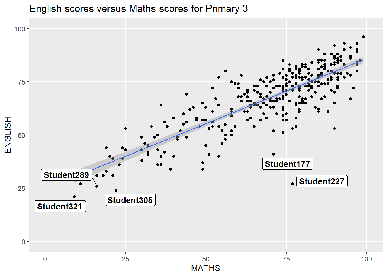
2.4 Beyond ggplot2 Themes
ggplot2 comes with eight built-in themes
ggplot(data=exam_data,
             aes(x = MATHS)) +
  geom_histogram(bins=20,
                 boundary = 100,
                 color="grey25",
                 fill="grey90") +
  theme_gray() +
ggtitle("Distribution of Maths scores") 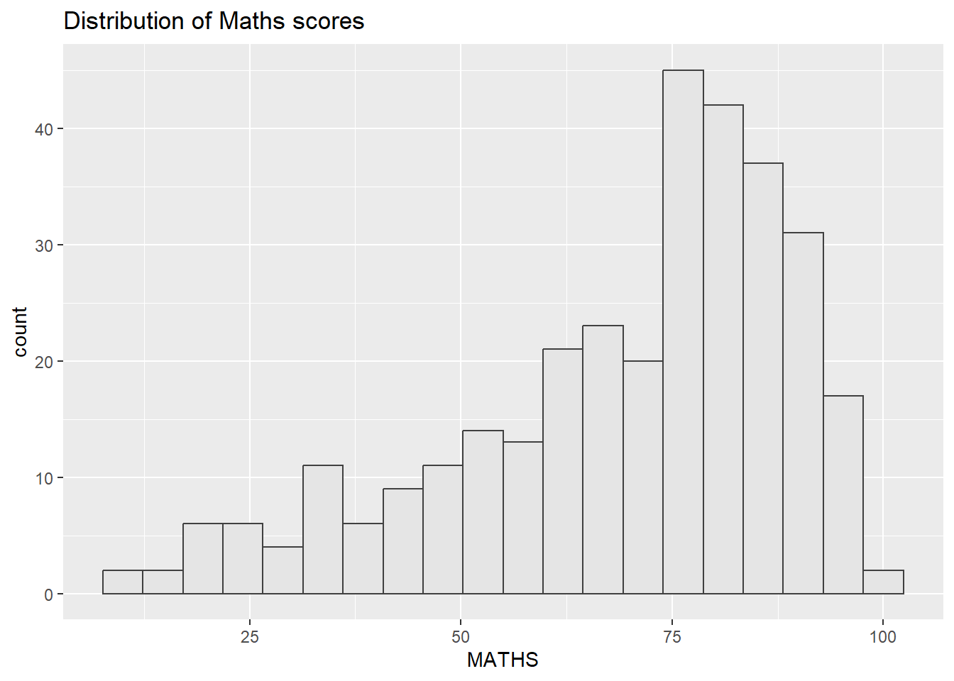
Refer to this link to learn more about ggplot2 Themes
2.4.1 Working with ggtheme package
ggthemes provides ‘ggplot2’ themes that replicate the look of plots by Edward Tufte, Stephen Few, Fivethirtyeight, The Economist, ‘Stata’, ‘Excel’, and The Wall Street Journal, among others.
ggplot(data=exam_data,
             aes(x = MATHS)) +
  geom_histogram(bins=20,
                 boundary = 100,
                 color="grey25",
                 fill="grey90") +
  ggtitle("Distribution of Maths scores") +
  theme_economist()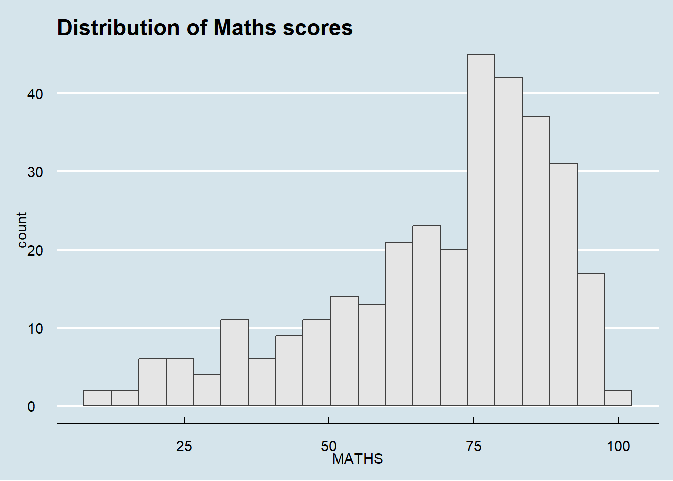
2.4.2 Working with hrbthems package
hrbrthemes package provides a base theme that focuses on typographic elements
ggplot(data=exam_data,
             aes(x = MATHS)) +
  geom_histogram(bins=20,
                 boundary = 100,
                 color="grey25",
                 fill="grey90") +
  ggtitle("Distribution of Maths scores") +
  theme_ipsum()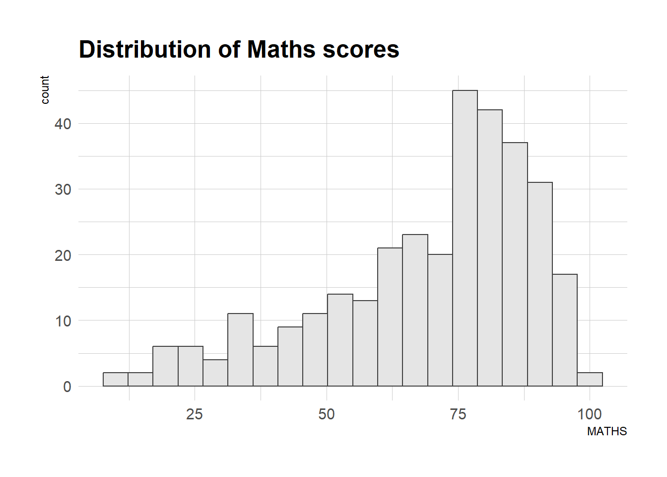
Consult this vignette to learn more.
ggplot(data=exam_data,
             aes(x = MATHS)) +
  geom_histogram(bins=20,
                 boundary = 100,
                 color="grey25",
                 fill="grey90") +
  ggtitle("Distribution of Maths scores") +
  theme_ipsum(axis_title_size = 18,
              base_size = 15,
              grid = "Y")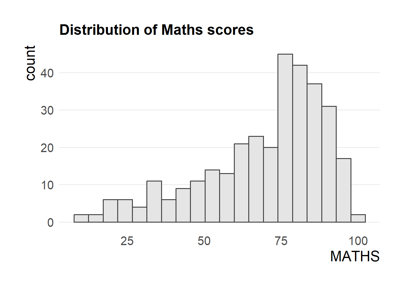
2.5 Beyond Single Graph
p1 <- ggplot(data=exam_data,
             aes(x = MATHS)) +
  geom_histogram(bins=20,
                 boundary = 100,
                 color="grey25",
                 fill="grey90") +
  coord_cartesian(xlim=c(0,100)) +
  ggtitle("Distribution of Maths scores")
p1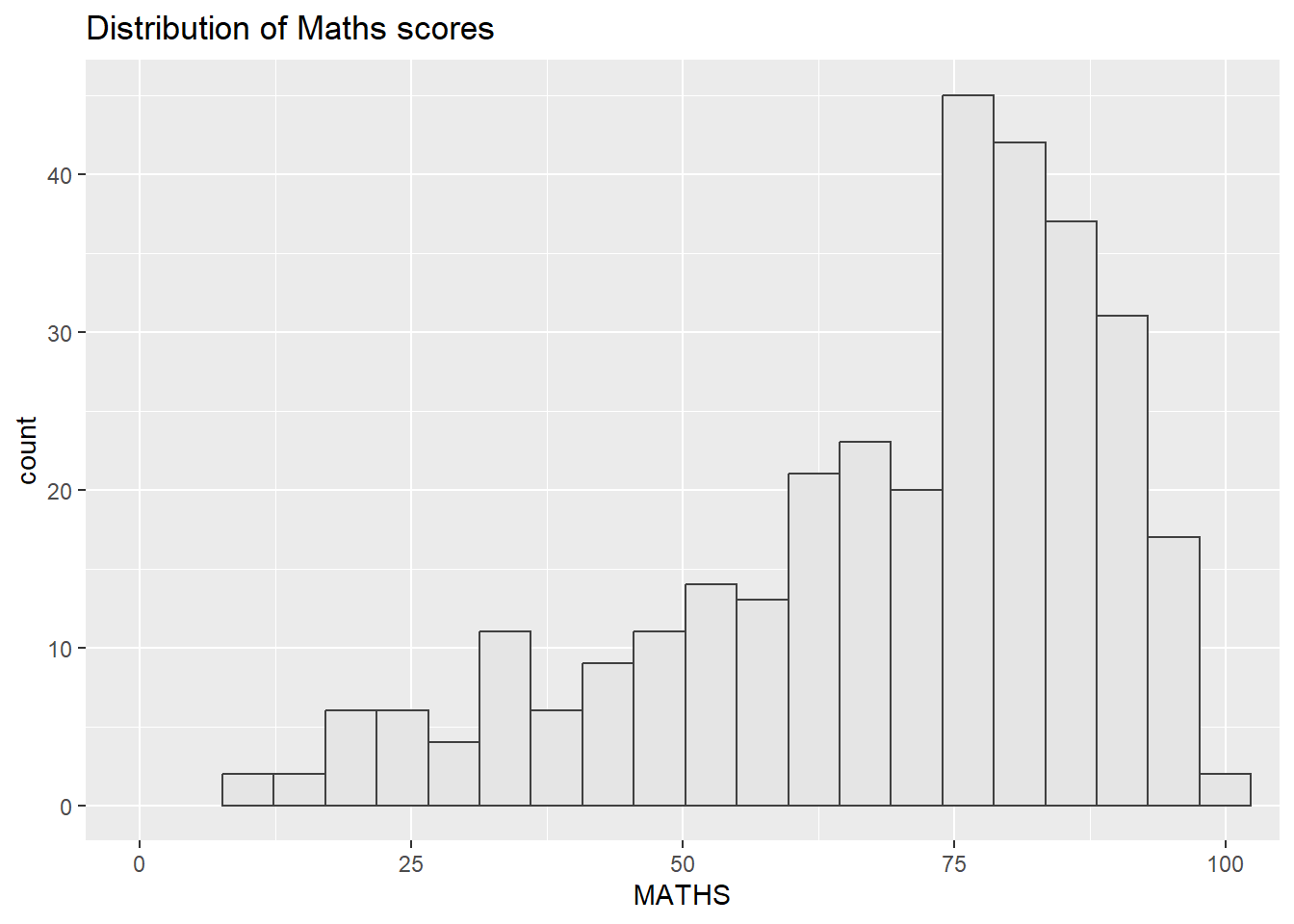
Next
p2 <- ggplot(data=exam_data,
             aes(x = ENGLISH)) +
  geom_histogram(bins=20,
                 boundary = 100,
                 color="grey25",
                 fill="grey90") +
  coord_cartesian(xlim=c(0,100)) +
  ggtitle("Distribution of English scores")
p2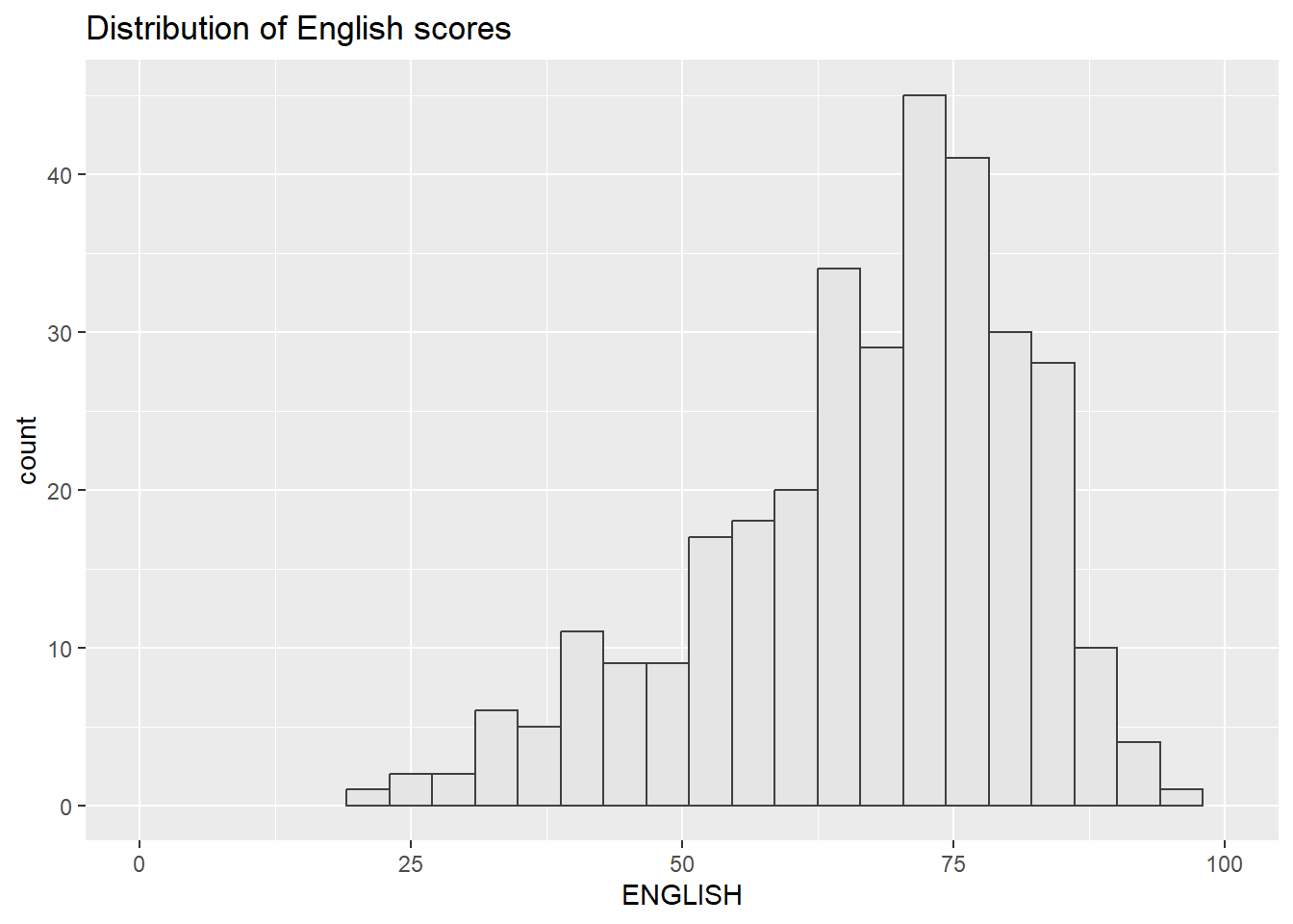
Lastly, we will draw a scatterplot for English score versus Maths score by as shown below:
p3 <- ggplot(data=exam_data,
             aes(x= MATHS,
                 y=ENGLISH)) +
  geom_point() +
  geom_smooth(method=lm,
              size=0.5) +
  coord_cartesian(xlim=c(0,100),
                  ylim=c(0,100)) +
  ggtitle("English scores versus Maths scores for Primary 3")
p3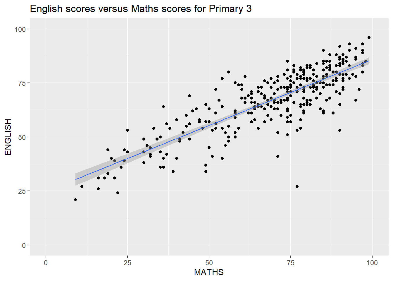
2.5.1 Creating Composite Graphics: pathwork methods
There are several ggplot2 extension’s functions support the needs to prepare composite figure by combining several graphs such as grid.arrange() of gridExtra package and plot_grid() of cowplot package. In this section, I am going to shared with you an ggplot2 extension called patchwork which is specially designed for combining separate ggplot2 graphs into a single figure.
2.5.2 Combining two ggplot2 graphs
p1 + p2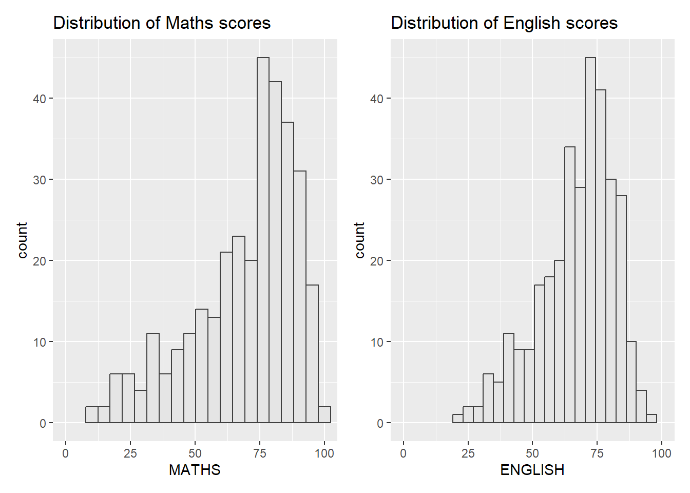
2.5.3 Combining three ggplot2 graphs
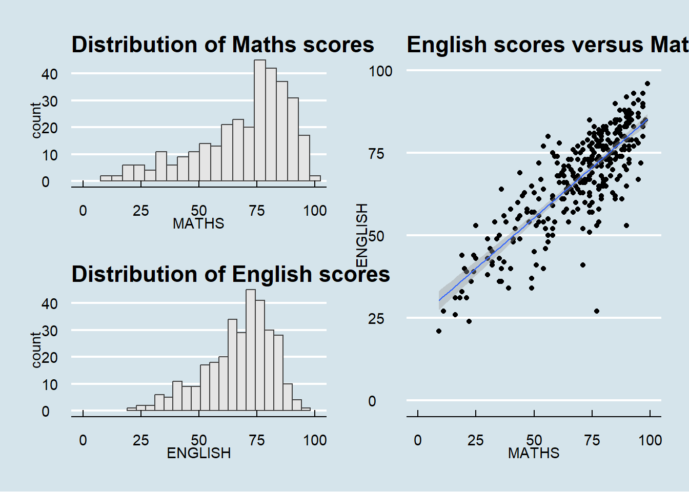
We can plot more complex composite by using appropriate operators. For example, the composite figure below is plotted by using: Plot Assembly
“/” operator to stack two ggplot2 graphs,
“|” operator to place the plots beside each other,
“()” operator the define the sequence of the plotting.
(p1 / p2) | p3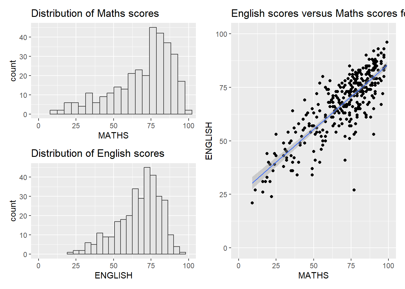
2.5.4 Creating a composite figure with tag
In order to identify subplots in text, patchwork also provides auto-tagging capabilities as shown in the figure below:
((p1 / p2) | p3) +
  plot_annotation(tag_levels = 'I')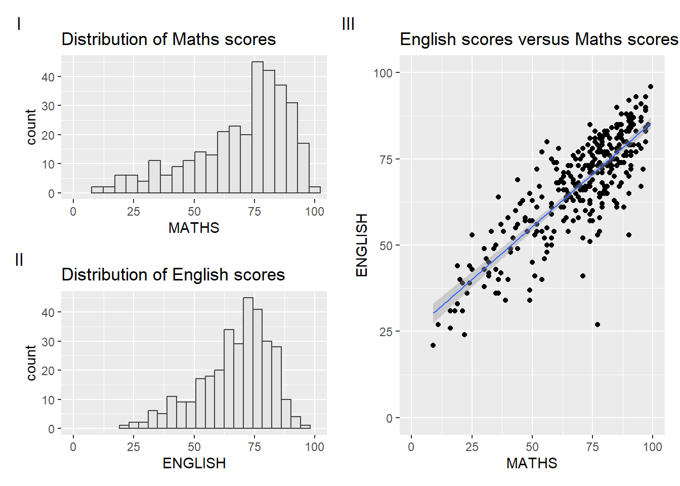
2.5.5 Creating figure with insert
Beside providing functions to place plots next to each other based on the provided layout. With inset_element() of patchwork, we can place one or several plots or graphic elements freely on top or below another plot.
p3 + inset_element(p2,
                   left = 0.02,
                   bottom = 0.7,
                   right = 0.5,
                   top = 1)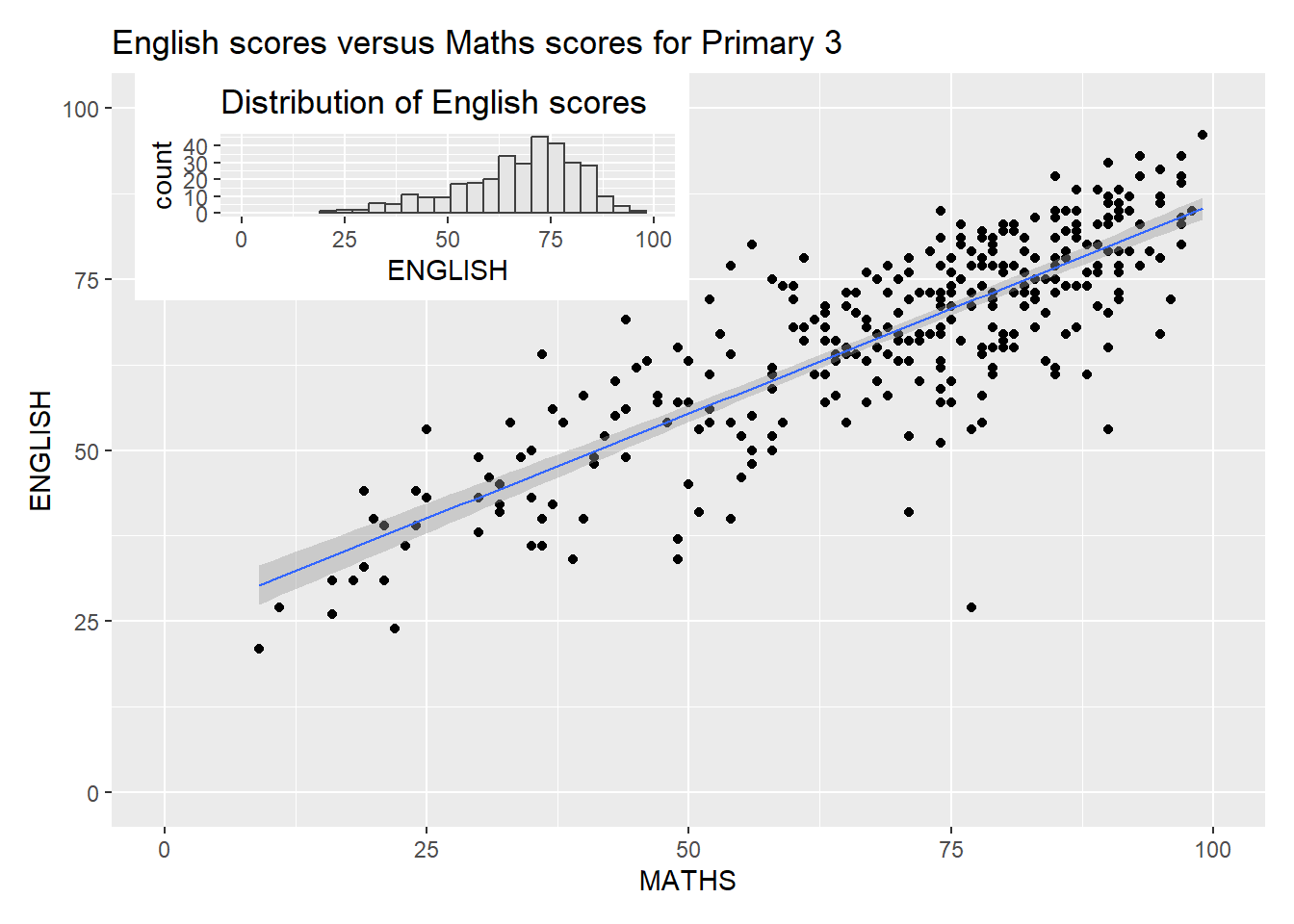
2.5.6 Creating a composite figure by using patchwork and ggtheme
patchwork <- (p1 / p2) | p3
patchwork & theme_economist()