pacman::p_load(readxl, gifski, gapminder,
plotly, gganimate, tidyverse)Hands-on_Exercise3
4 Programming Animated Statistical Graphics with R
4.1 Overview
When telling a visually-driven data story, animated graphics tends to attract the interest of the audience and make deeper impression than static graphics. In this hands-on exercise, you will learn how to create animated data visualisation by using gganimate and plotly r packages. At the same time, you will also learn how to (i) reshape data by using tidyr package, and (ii) process, wrangle and transform data by using dplyr package.
4.1.1 Basic concepts of animation
When creating animations, the plot does not actually move. Instead, many individual plots are built and then stitched together as movie frames, just like an old-school flip book or cartoon. Each frame is a different plot when conveying motion, which is built using some relevant subset of the aggregate data. The subset drives the flow of the animation when stitched back together.
4.1.2 Terminology
Before we dive into the steps for creating an animated statistical graph, it’s important to understand some of the key concepts and terminology related to this type of visualization.
Frame: In an animated line graph, each frame represents a different point in time or a different category. When the frame changes, the data points on the graph are updated to reflect the new data.
Animation Attributes: The animation attributes are the settings that control how the animation behaves. For example, you can specify the duration of each frame, the easing function used to transition between frames, and whether to start the animation from the current frame or from the beginning.
4.2 Getting Started
4.2.2 Importing the data
col <- c("Country", "Continent")
globalPop <- read_xls("data/GlobalPopulation.xls",
sheet="Data") %>%
mutate_each_(funs(factor(.)), col) %>%
mutate(Year = as.integer(Year))col <- c("Country", "Continent")
globalPop <- read_xls("data/GlobalPopulation.xls",
sheet="Data") %>%
mutate_at(col, as.factor) %>%
mutate(Year = as.integer(Year))col <- c("Country", "Continent")
globalPop <- read_xls("data/GlobalPopulation.xls",
sheet="Data") %>%
mutate(across(col, as.factor)) %>%
mutate(Year = as.integer(Year))4.3 Animated Data Visualisation: gganimate methods 4.3.1 Building a static population bubble plot
In the code chunk below, the basic ggplot2 functions are used to create a static bubble plot.
ggplot(globalPop, aes(x = Old, y = Young,
size = Population,
colour = Country)) +
geom_point(alpha = 0.7,
show.legend = FALSE) +
scale_colour_manual(values = country_colors) +
scale_size(range = c(2, 12)) +
labs(title = 'Year: {frame_time}',
x = '% Aged',
y = '% Young') 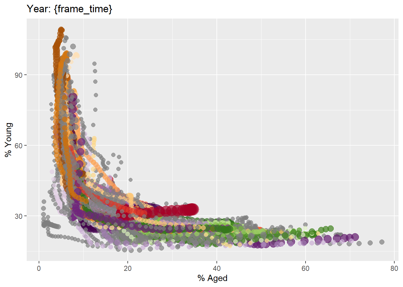
4.3.2 Building the animated bubble plot
In the code chunk below,
transition_time()of gganimate is used to create transition through distinct states in time (i.e. Year).ease_aes()is used to control easing of aesthetics. The default islinear. Other methods are: quadratic, cubic, quartic, quintic, sine, circular, exponential, elastic, back, and bounce.
anim <- ggplot(globalPop, aes(x = Old, y = Young,
size = Population,
colour = Country)) +
geom_point(alpha = 0.7,
show.legend = FALSE) +
scale_colour_manual(values = country_colors) +
scale_size(range = c(2, 12)) +
labs(title = 'Year: {frame_time}',
x = '% Aged',
y = '% Young') +
transition_time(Year) +
ease_aes('linear')
animate(anim,
renderer = gifski_renderer("global_pop.gif"))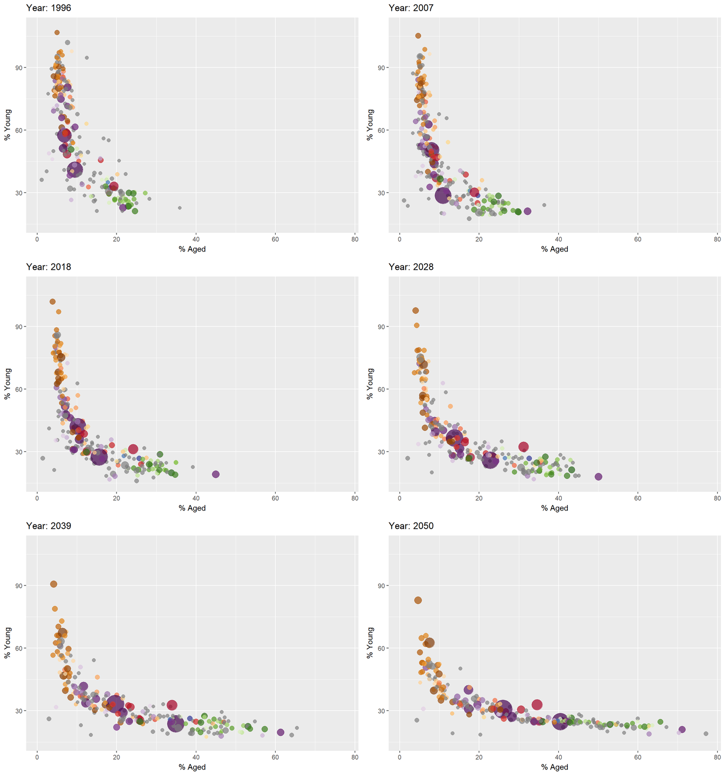
knitr::include_graphics("global_pop.gif")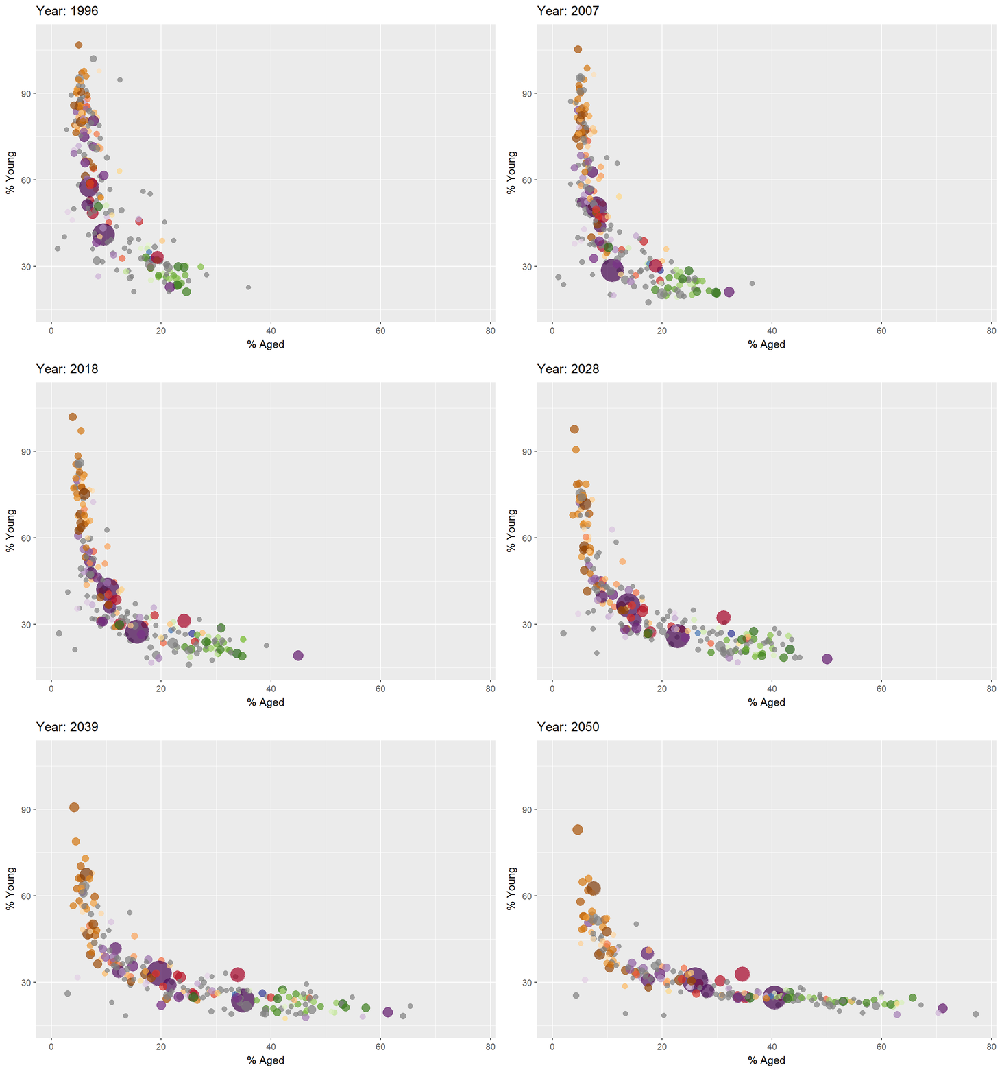
4.4 Animated Data Visualisation: plotly
In Plotly R package, both ggplotly() and plot_ly() support key frame animations through the frame argument/aesthetic. They also support an ids argument/aesthetic to ensure smooth transitions between objects with the same id (which helps facilitate object constancy).
4.4.1 Building an animated bubble plot: ggplotly() method
In this sub-section, you will learn how to create an animated bubble plot by using ggplotly() method.
gg <- ggplot(globalPop,
aes(x = Old,
y = Young,
size = Population,
colour = Country)) +
geom_point(aes(size = Population,
frame = Year),
alpha = 0.7,
show.legend = FALSE) +
scale_colour_manual(values = country_colors) +
scale_size(range = c(2, 12)) +
labs(x = '% Aged',
y = '% Young')
ggplotly(gg)Notice that although show.legend = FALSE argument was used, the legend still appears on the plot. To overcome this problem, theme(legend.position='none') should be used as shown in the plot and code chunk below.
gg <- ggplot(globalPop,
aes(x = Old,
y = Young,
size = Population,
colour = Country)) +
geom_point(aes(size = Population,
frame = Year),
alpha = 0.7) +
scale_colour_manual(values = country_colors) +
scale_size(range = c(2, 12)) +
labs(x = '% Aged',
y = '% Young') +
theme(legend.position='none')
ggplotly(gg)4.4.2 Building an animated bubble plot: plot_ly() method
In this sub-section, you will learn how to create an animated bubble plot by using plot_ly() method.
bp <- globalPop %>%
plot_ly(x = ~Old,
y = ~Young,
size = ~Population,
color = ~Continent,
sizes = c(2, 100),
frame = ~Year,
text = ~Country,
hoverinfo = "text",
type = 'scatter',
mode = 'markers'
) %>%
layout(showlegend = FALSE)
bp4.5 Reference
Visit this link for a very interesting implementation of gganimate by your senior.